Follow along with the video below to see how to install our site as a web app on your home screen.
Note: This feature may not be available in some browsers.
Did ASA have a hand in this? Must have been the same group that came up with the SureJet thing.
Hard for an airline to have a nice paintjob???!?!?! Alaska Airlines has kept that beautiful face on the tail for years now!
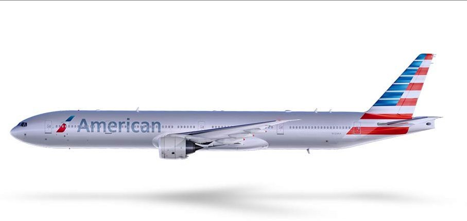
The more I see the new logo, the more I think they could fix this whole mess by having the new stylized Eagle logo enlarged to fit the entire tail. That stylized Eagle logo on the tail would be striking and go with the rest of the livery perfectly. Anyone at AA want to send that idea to your bosses?
The incredible thing about this ugly livery is that AA actually paid someone to come up with it... BUHUHUHAAAAa
To the people at the marketing firm that came up with this - they do know that the way they have the flag painted on the tail (when viewed from the right) is the wrong way to display the flag. Not to mention they have it altered with the white stripes (also wrong). Pretty disrespectful in my book.
video when viewed from right:
http://www.youtube.com/watch?v=J-KD0PdI1Ek&feature=youtu.be
this would have been nicer.
http://www.cardatabase.net/modifiedairlinerphotos/photos/big/00015113.jpg
The last eagle was iconic; this one appears as if it has a disembodied head.
Matthias Mencke, a creative director at Siegel+Gale, emailed BI that "the new American Airlines logo surely looks more contemporary, but it also lacks the strength the older visual identity had. Is the slimmer rendering with a small, somewhat weak looking eagle's head American Airlines acceptance of not being a leading brand in the airline industry anymore?"
American hired Future Brands to create the new logo.