Always deferred
Well-known member
- Joined
- Jun 5, 2003
- Posts
- 175
Follow along with the video below to see how to install our site as a web app on your home screen.
Note: This feature may not be available in some browsers.
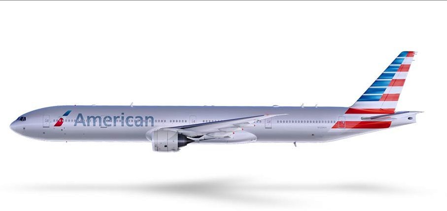
Several leaks on Airliners.net.
Not sure how I feel about the look of the new planes...Especially the tail.
Thoughts?

Did ASA have a hand in this? Must have been the same group that came up with the SureJet thing.
I like the lettering down the side, but the tail is pretty hideous.
Thanks for the video.
I guess some will like it. My guess is most won't. Why is it so difficult for an airline to have a nice looking paint job?
Considering how pilots hate change, the fact that some on here actually like it means it's pretty good. On a side note, I guess the merged company will still be American. I would have put money on American Airways.
 uke:
uke: